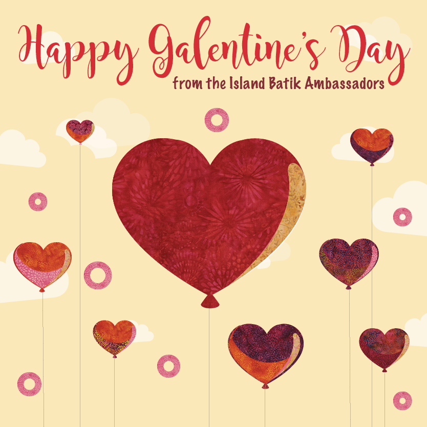
If you are a fan of the TV show Parks & Rec, you are probably familiar with Galentine’s Day. The main character Leslie (played by Amy Poehler), holds a Galentine’s Party with her girlfriends each year on the night before Valentine’s Day. It made me smile to see this graphic sent to the Ambassadors by Island Batik.
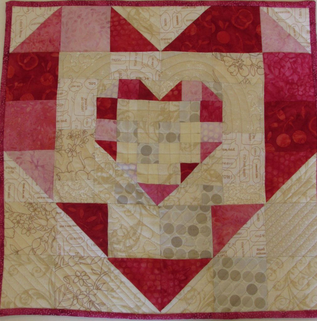
Since I was in the spirit, last week I made a Valentine, to me from me. I have a number of little heart mini quilts that I have made over the last several years. I like them. Simple hearts of red, pink, cream and white. Remember how much fun Valentine’s Day was? We decorated brown paper bags, wrote the “to” and “from” on each card, and hoped there would be some candy involved.
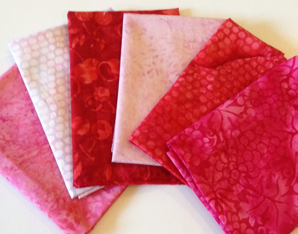
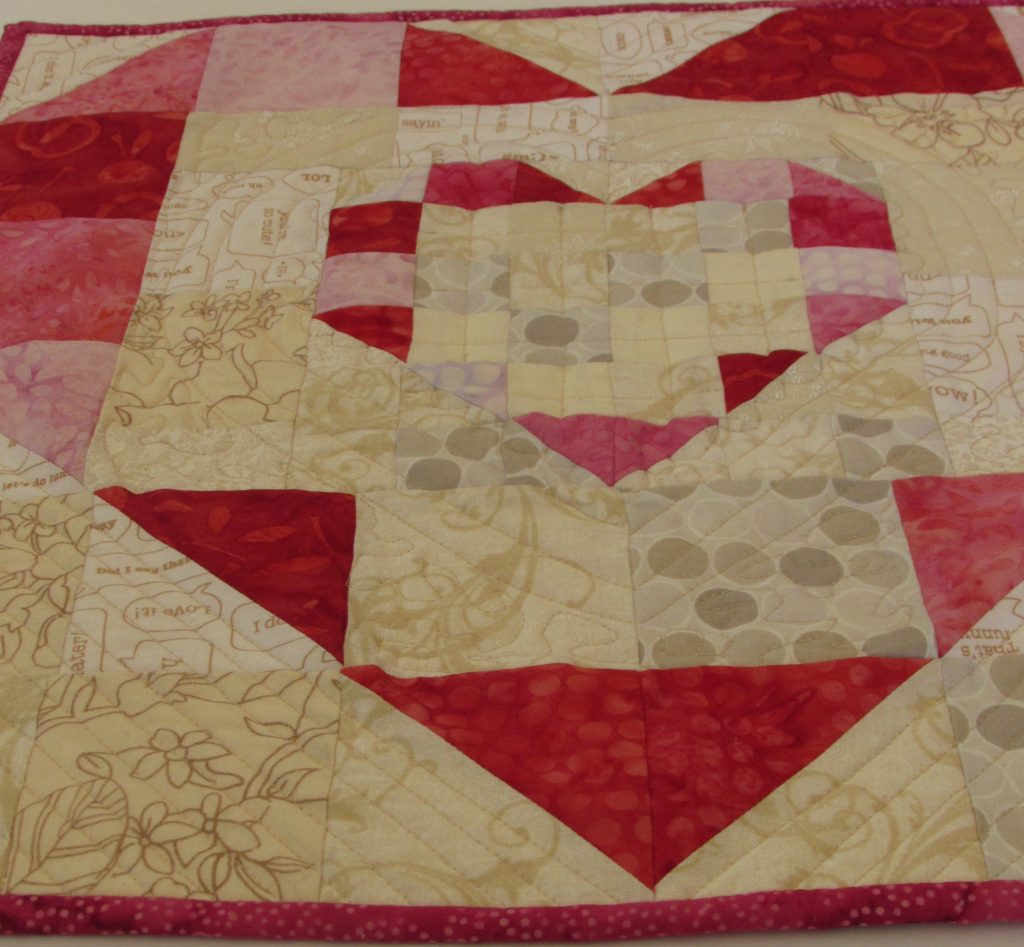
This year Island Batik included some red and pink batik fat quarters in each of the Ambassador boxes. It just so happened that I recently purchased a pattern from Jayne of Twiggy and Opal called Rainbow Heart Trio. I made just one of the three minis included in the pattern. Don’t you love how the tiny heart is nestled into the center of the larger heart? Since I only made the one mini, I have hardly made a dent in the bundle of pinks and red fat quarters. No worries though, Island Batik has plenty of projects in store for us. I will put them to use soon enough.
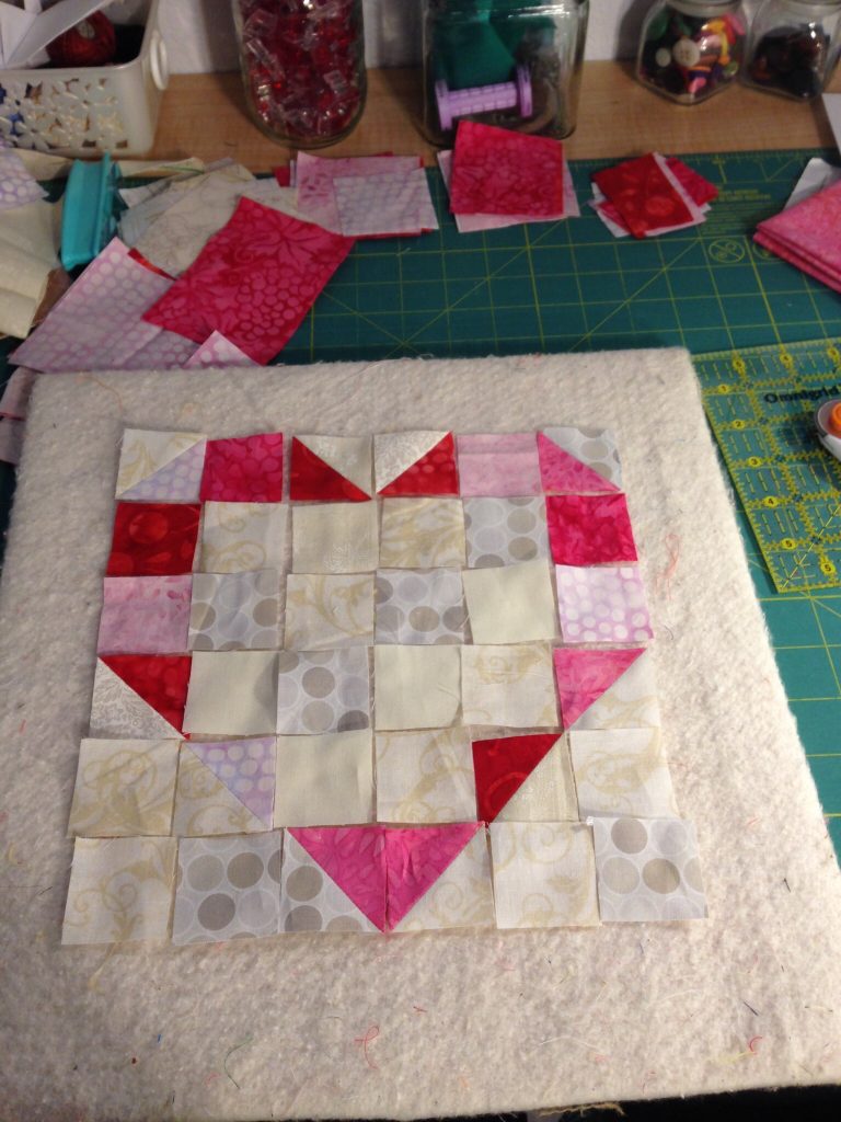
This project was yet another lesson in value and color (when, oh when, will I learn these lessons!?) If you look at the tiny heart, you might notice a few pieces of a pale dotted batik. It is a very pale shade of lavender. On its own, it is very pretty. Included with this project and surrounded by the creamy background pieces, it is totally lost. I didn’t really get it until that smaller heart was surrounded by the larger heart. Looking at the photo above, this is the smaller heart when I was piecing it. I thought there was just enough difference between that pale dotted batik and the background. Once it was surrounded by the background it faded out. I also had some of that fabric used as blocks in the larger heart. I was able to unpick those stitches and swap the fabric out with something darker. I left the smaller heart alone. I will get this figured out one day. But for now, the shape of the smaller heart doesn’t show up as much as it would have if I had used darker fabric in those spots. I will get there though. It just takes practice.
The Rainbow Heart Trio pattern comes together quite easily. The longest task is definitely the cutting. The HST’s that make up the smaller heart finish out at 1 1/2″. Tiny little things. I quilted it with my walking foot. The quilting was inspired by the pattern. I liked how Jayne quilted the samples and I followed along with her. The only part that I free motioned was the little scallops around the outer edge of the smaller heart.
Wishing each of you a Happy Galentine’s Day and an even sweeter Valentine’s Day!
Linking to all of my favorites. Check out the tab at the top of the page, Link Ups.

Very cute, Bernie!
I like that the heart kind of fades away. It’s more of an idea of a heart. Happy Glaentines Day Bernie.
What a sweet finish and gift for yourself. Sometimes color value can be a tricky thing (I’m scratching my head over a quilt I’m working on now on that very topic)!
It is very tricky for me. When I put the colors together as a pull, that pieced appeared much deeper to me. Then when it was surrounded by the background pieces, it just faded away. I need to somehow slow down before I stitch rows together and look at things for a while. Maybe it would come to the forefront of my mind then?
Very cute Bernie. I think we learn something from every project we make. Happy Galentine’s Day!!!
Oh my gosh, Stephanie, that’s for sure. I am constantly learning. That’s a good thing though.
This is really cute, but I have a suggestion for value. If you’re in doubt, when you lay your pieces out, use your cell phone to take a photo in black and white. Most can do it (just play with it). If you can’t do black and white, squint your eyes, or take a color photo and look at it on your phone (or the camera). It gets your eyes away from the colors and you can see the value clearer. Let me know if this works.
Thank you. I have heard of doing this and have tried using the phone to look at the tones. My biggest problem is I go too fast and forget to do it. I need to slow down and check things along the way.
Have a good week!
I don’t mind the ‘problem’ with the color value at all. Not even one little bit!! Like you, I will never learn and I haven’t really tried either! Thank you so much for sharing your beautiful hearts and showcasing my pattern! I have really enjoyed watching your progress! The daffodils are amazing…such a great shop! Happy Galentine’s day to you as well…today was the first time I have ever heard about it!
Value (and hue) is so relative, isn’t it? My current mystery quilt is going to have some of that going on, I’m afraid. Just gowing to roll with it. Your heart quilt turned out very pretty.
Hello Bernie ,
Gorgeous shades of pink. It doesn’t matter that they don’t all show up as you wanted. We all do it. Half the fun is being forced to take a closer look.
Thank you for linking up with Free Motion Mavericks!
Love, Muv