I have mentioned before that I am participating in the Michael Miller Fabric Challenge, sponsored by the Modern Quilt Guild. There are many quilters out there that signed up for this last spring. The deal is that you receive a collection of fat eighths from the new Michael Miller line, Glitz. The goal is to make a quilt of some sort using a minimum of one piece of Glitz and any other Michael Miller fabrics. (All fabrics used must be Michael Miller.)
My fabric arrived in July last summer. At first glance, I wasn’t too wild about the prints. There is a whole lot of shimmer in this fabric. I quickly ordered some solids (gray, red and black) to tone down the collection. The gray turned out to be a bad match. It was very flat when paired with the fabrics. The red and black work fine though. After receiving all of the fabric, it sat on my sewing table for weeks. I kept looking at it and trying to figure out what I wanted to make. I was feeling less than inspired.
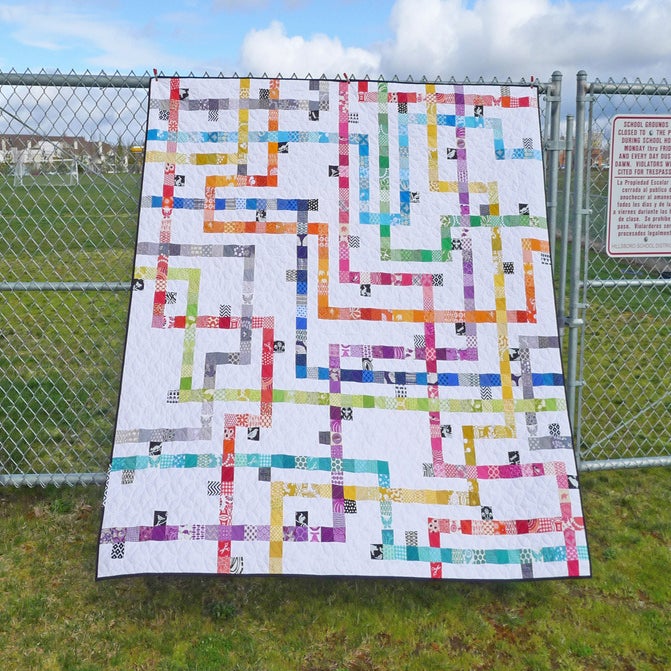
Time was moving along and I knew I had to get this figured out. Luckily for me, my sister Patti was in town two weeks ago and she was a great help. She has a great talent for design and decorating. I pulled out the fabrics and we started going through my Pinterest boards. Talking through this with her, I decided to make a mini that was angular, with a sharp pattern. It didn’t take too long to decide to use the Tokyo Subway Map pattern, designed by Elizabeth Hartman. I purchased and downloaded it right then. Can’t beat the instant gratification of internet shopping!
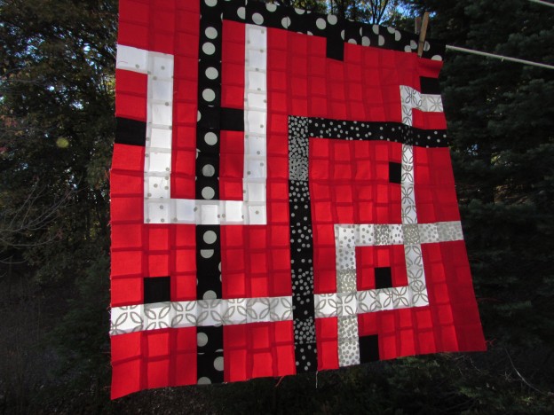
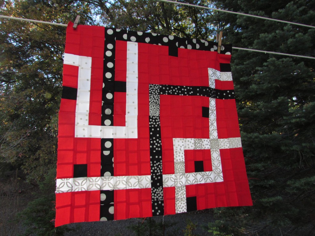
This is a great pattern that I have admired for quite a while now. For this immediate project, I decided to make four of the blocks from the pattern, using 2 1/2″ squares (which is smaller than what the pattern calls for.) Reducing the size of the squares made it possible to make my quilt finish out at 24″ x 24″.
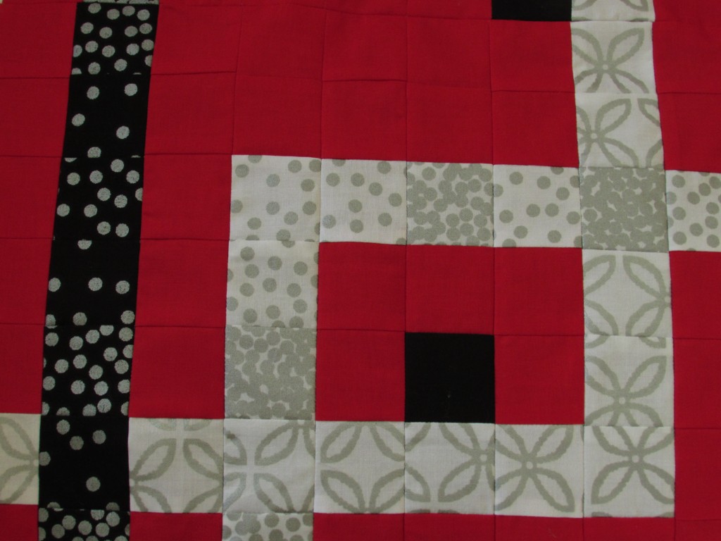
I love the bright red background with the black, silver and white prints.
 The red sections could be a great avenue for some fun quilting. I (nothing new here) keep going back and forth on a quilting plan. I have sketched, looked through my books and perused Pinterest but still am not set on what I will do. I am concerned that the busy pattern and fabric calls out for tight straight-line quilting. But then I look at that negative space created by the red sections. If I quilt just that portion, leaving the printed sections unquilted, that could be pretty interesting. It would make an nice pattern on the back as well. (Speaking of which, I better get busy with the back. I will have to piece it with a very limited amount of fabric.)
I know I can rely on you guys for input. Feel free to give me an opinion. The other issue is time. I need to have this completed and photographed by November 30. All participants are required to submit photos of their project by the last day of November.
Hope you are all enjoying Autumn. We Californians are totally loving the rain that we have been gifted with over the last couple of weeks. They are forecasting for more over the weekend. Yahoo!
Linking to Amanda Jean over at Crazy Mom Quilts as well as Sarah from Confessions of a Fabric Addict. Link ups to these amazing quilters are available at the top of the page, under Link Ups.


WOW this is bold, dramatic, and just gorgeous.
Well in applique, people echo quilt or cross hatch or whatever to outline the applique and I think that whatever you do I’d accentuate the black, creams, etc by quilting in the red spaces yes.
Now hurry up, ha ha!
Hurry up! Exactly! I keep practicing and piddling around with other stuff – Time to get this going. Hope you are enjoying your Sunday afternoon! It is rainy and cold here, awesome!
Hmm… maybe straight parallel lines close together following the paths, and then something curvy or loopy in the red? But matchstick could be really cool, too, especially since it’s a small quilt. And then there are all those neat concentric circle quilts. Clearly, I’m no help. (But you know me. I’m an over-quilter.) I think you did a great job of using the red to showcase the glitzy fabrics. There’s a lot of movement, with those little black squares as resting places. (Ooh, they could have their own little design–a little circle?)
I am leaning toward something curvy. I think it will look best with the angular pattern of the quilt. I am practicing some large concentric spiraling. It is kind of fun – using my walking foot. I am just nervous to commit and start on the real piece!
Oh what a lovely extract from the original pattern, and yes, definitely the place for some fun quilting
Thanks Carie. This pattern was perfect for a mini. It was so simple to make only a portion of her blocks. Hope you are having a nice Sunday afternoon!
B.
Pretty! I like your idea of quilting just the red space. It really would make an interesting detail on the back.
I may borrow your sister. Design is my weakest link.
I LOVE downloadable patterns!
Same here Linda. I can work from a pattern or copy a picture of something but I cannot create a design. My mind doesn’t work that way! Oh well…. such is life. Thankfully there are zillions of patterns to choose from! Hope all is well with you.
B.
Sometimes it takes a second eye to come up with a good plan. I agree, this pattern works very well with the fabrics you used. As for quilting, if a pattern is very angular I typically try to do some curves to soften it out, but for this project, I think the subway angles are what make it appealing. Maybe using either of these designs would look good: http://freemotionquilting.blogspot.com/2010/07/day-204-spiral-illusion.html?m=1 or a square type of meander like this: http://www.quiltscomplete.com/Products/Cool-Beans—Digital__AM-CBN_DIGITAL.aspx
Hi: Thanks for both of these links. I appreciate it. I decided I will definitely use a curve of some sort when I quilt it. I have been practicing some spirals. I better make a decision soon and get this going!
Take care,
Bernie
Use that “bad match” gray for the back! Hey, it’s on the back.
That’s exactly what I did! I pieced the back with my leftovers, including the gray! Thanks for stopping by.